For the web side of the brief I have been looking at existing online menus. I am going to create an online menu that will work across iPad and smartphones platforms.
Existing Japanese Restaurant Websites
I want to see what information is common on restaurant websites so I can identify what is necessary for mine and how to best use navigation for better usability.

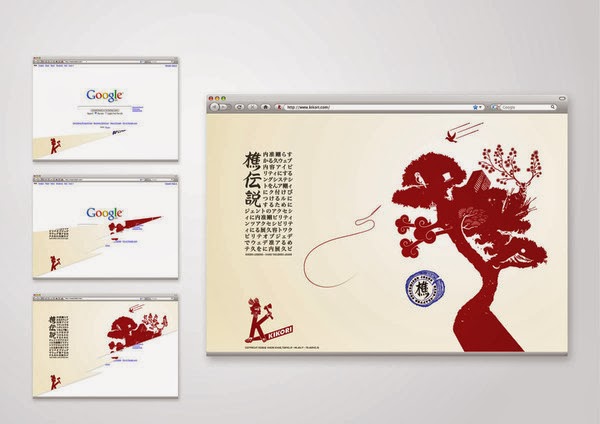
This website has drop down down menu to the left, I could use drop downs to break the menu into easy accessible sections.

I don't think this website is very good, it looks cluttered and confusing. I want to keep my design minimal and easy to use.


This site uses similar colours to mine and uses images. I hadn't though about images but I could include some on the homepage or menu pages.


I think this design uses the space well, its clear, precise with information and easy to use.

A three column grid could be a good way to display the menu on an iPad.

The website above looks sleek and contemporary, I think something similar to this we be appropriate and work with the printed material.

From what I have seen I have noticed common things:
Navigation:
-Top bar
-Drop down menus
Pages/Content to include could be:
-Homepage
-Menu
-Opening hours
-Map
-Contact Details
Existing Responsive Websites
I want to display my website across platforms so I wanted to have a look at how some websites achieved this.
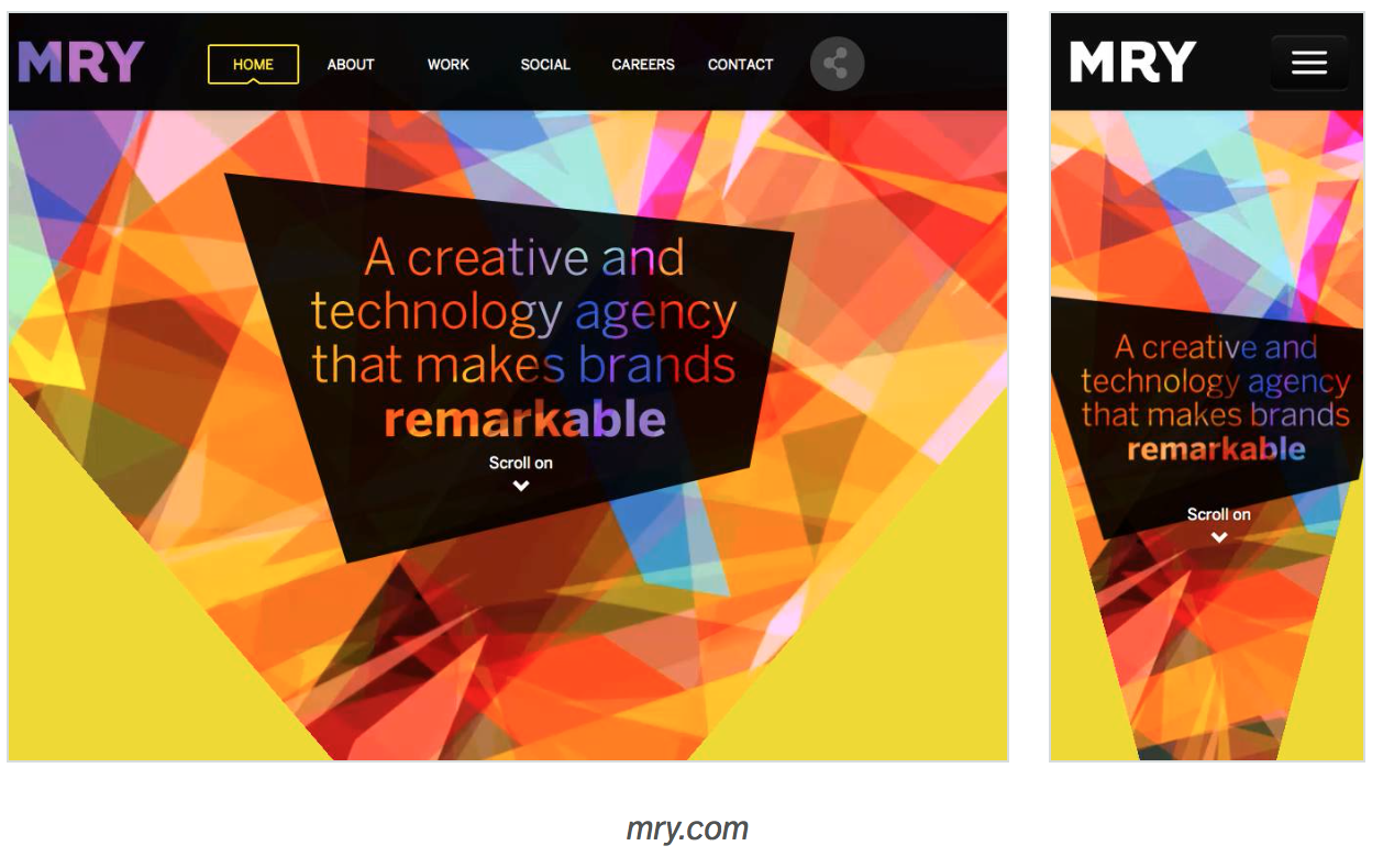
Using buttons like this design could be a way of me displaying the links for the menu page of my site.

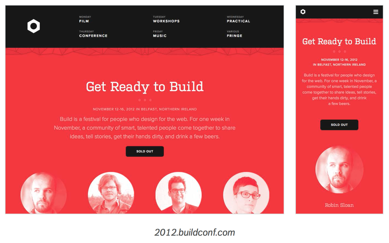
This design has the links at the top of the page like the desktop design. I could have the two page links at the top of the screen.
I noticed that a lot of sites use the menu icon at the top, this swipes the screen to the left to reveal a hidden page. I like how this works but I'm not sure if would be appropriate for my site.
Dimensions
I wasn't sure what the screen sizes were for the iPad and phone.

:1024x768px
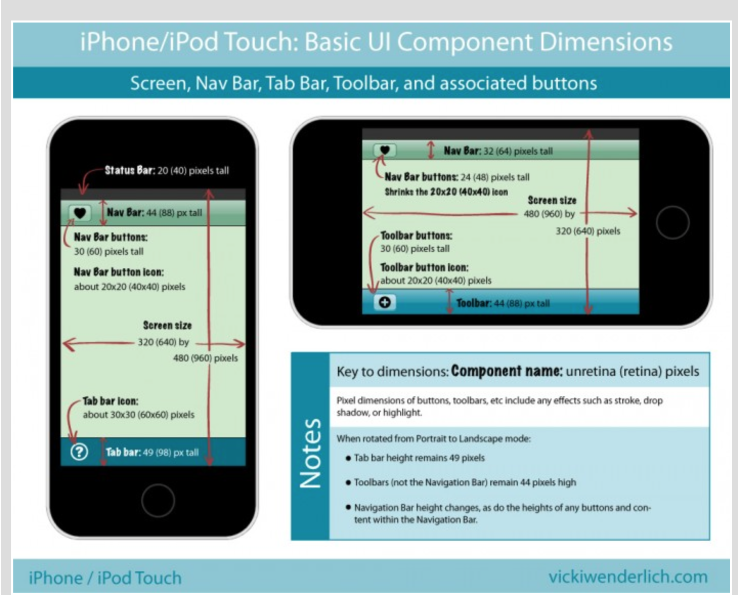
:320x480px
No comments:
Post a Comment