The company that I created the logo and branding for have been back in touch and have asked me to design the posters and flyers for the events.
Poster/Print


The colours in the image above are similar to the ones I used in the other work I did for them so I'm thinking it might be a good idea to use the same colours for the first poster so people will associate the poster with the brand.


The Tape Mag Prints


I really like these tapeMag prints.There more illustrative which is something I will need to think about. I won't to try and balance illustration with type if its appropriate, I think it will depend on the amount of information that needs to go on them.

The image above has a really nice texture to it, the poster will be printed digitally so I would like like to replicate this style.


The design above has a grimy feel to it which I think will communicate the style of music really well.
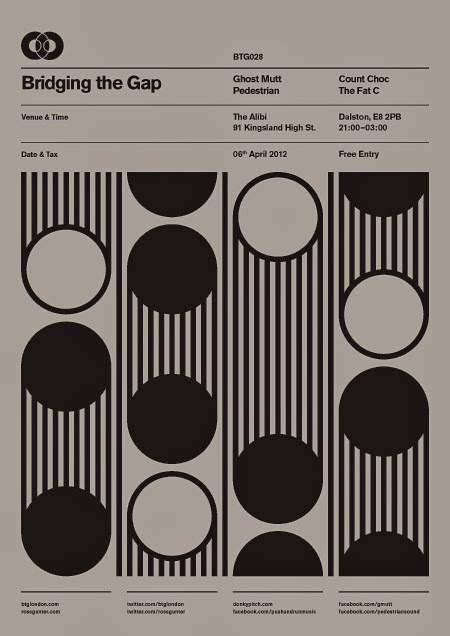
Bridging the Gap Poster series


Flyers
I will need to design some A6 flyers asell so I had a quick look at some examples to see how information can be laid out on a smaller scale.

The flyers will be double sided so I think the front will need to be simple with lots of impact to make them stand out.


The back of the flyer will have the majority of the information on so it will need to be simple for readability/legibility.


90's Theme Research


No comments:
Post a Comment